Creating Content for the Mobile Experience
Writing for Users on the Go
More than 30% of SHSU’s web traffic comes from mobile devices — and in some areas, that number is even higher. For many users, mobile isn’t just the first impression; it’s the only impression.
Best practices for mobile-friendly writing
- Keep paragraphs short. Limit them to 1–2 sentences.
- Test your text. Preview content at different screen sizes and text settings.
- Avoid PDFs. Unless a file is meant to be printed, publish content directly on the page.
- Think in columns. Multi-column layouts on desktops stack vertically on mobile devices. Ensure each column makes sense when read independently.
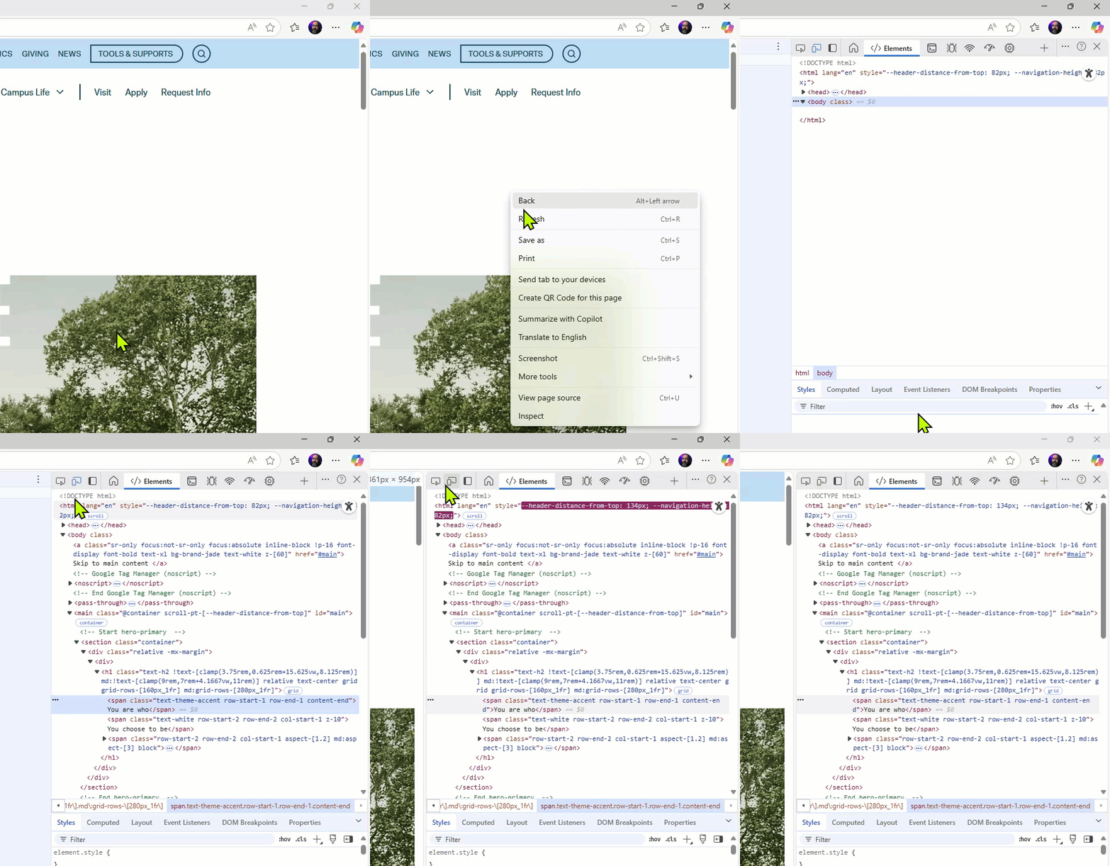
Preview a page in Mobile view
- Open the page in Google Chrome or Microsoft Edge.
- Right-click anywhere on the page.
- Select Inspect from the menu. The inspection panel will open, showing the page’s code.
- In the top-left corner of the inspection panel, click the icon that looks like a desktop and mobile device. The page will switch to a mobile preview.
- Click the same icon again to return to the desktop view.

Key Takeaway
Mobile readers want quick answers. Writing that is concise, scannable, and adaptable ensures they find what they need quickly while keeping the user’s experience at the center.